Worcester, MA — This Valentine’s Day, the Worcester Regional Transit Authority (WRTA) is debuting a brand-new look—and putting its heart on the road. WRTA will roll out its first newly branded bus featuring a new logo and heart-themed design that celebrates Worcester’s role as the Heart of the Commonwealth.
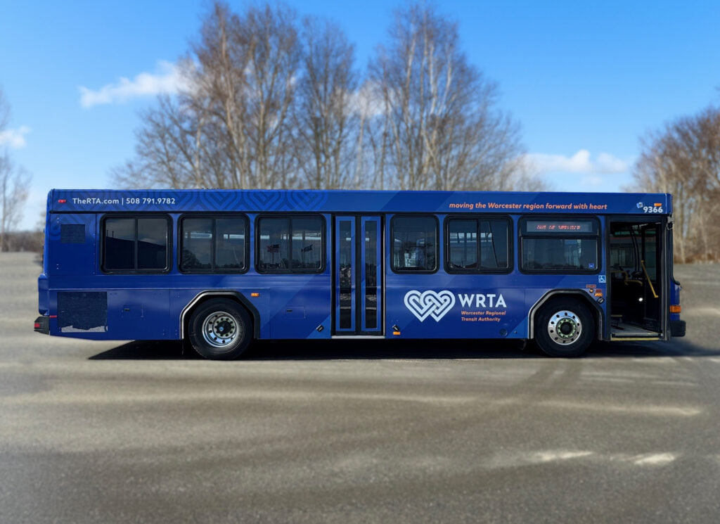
At the center of the new brand are two conjoined hearts forming a subtle “W” pattern, symbolizing connection at every level: from origin to destination, community to community, person to person, and operator to passenger. The design reflects both Worcester’s central location within Massachusetts and WRTA’s mission to deliver convenient, comfortable, safe, and reliable transportation throughout the region.
“This project was truly a labor of love,” said Josh Rickman, Administrator of WRTA. “Worcester sits at the heart of the Commonwealth, and our transit system plays a vital role in keeping that heart beating—connecting neighborhoods, businesses, schools, and communities across the region.”
To ensure the new brand authentically represents the community it serves, WRTA partnered with one of the nation’s leading transit design firms and conducted extensive public and internal outreach. More than 376 community members completed surveys, and WRTA staff were engaged throughout the process. Feedback showed strong support for retaining a blue color palette, widespread enthusiasm for the heart symbol, and a range of preferences across modern, timeless, and progressive design styles—insights that directly informed the final design.
The heart motif represents the people onboard and establishes a consistent, recognizable visual identity across the fleet. The new branding also standardizes the placement of contact information on the exterior of buses, improving clarity and system-wide recognition.
Safety and visibility were key considerations in the design. The new WRTA logo appears on all sides of each bus in retroreflective white to enhance visibility, while high-contrast elements support rider and roadway safety. Forward diagonal lines add a sense of movement and energy, reflecting WRTA’s role in keeping the region moving forward.
The new brand is anchored by WRTA’s updated slogan: “moving the Worcester region forward with heart.” The message captures the Authority’s commitment to service, connection, and pride in a city that truly sits at the heart of the Commonwealth.
This Valentine’s Day, riders will see more than a new look on the road—they’ll see a symbol of connection, community, and care traveling through the Worcester region.
Share the Love. See our new bus on the road? Share a photo or video and tag us on social media:
Instagram: @hop.on.wrta Facebook: @theWRTA X (formerly Twitter): @therta
Use #iHeartWRTA so we can see and share your posts.
#
The Worcester Regional Transit Authority (WRTA) is a regional transit system that services the City of Worcester and the surrounding 36 communities in the Central Massachusetts area with a bus fleet that includes diesel-electric hybrid buses, and clean-diesel buses. The second largest regional transit authority in Massachusetts, the WRTA offers reliable, comfortable, and safe transportation for traveling to work, shopping, school, medical appointments, and leisure activities. The WRTA also provides paratransit service for the elderly and disabled, as well as a variety of special services for those groups in the entire service area. In 2025, WRTA provided 5 million passenger trips throughout its system. All fixed routes and paratransit services are free through June 2026.
#
For media inquiries, please contact:
Jamie Winters
Director of Marketing & Communications
Phone: 508.453.3459
Email: jwinters@therta.com